Website review #9 - Fauzi Arda
Introduction
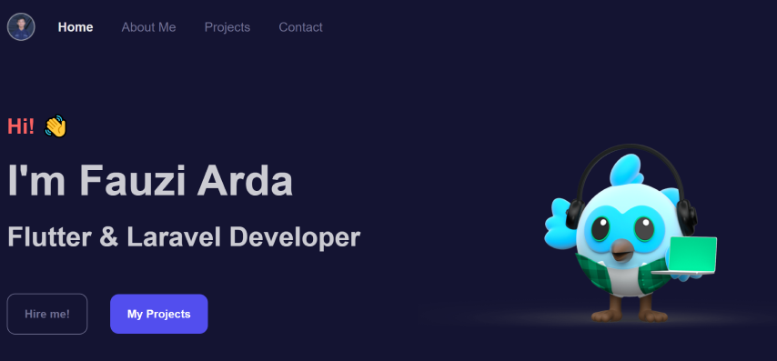
Last March, I've posted a tweet with a simple message: "Post your website and I'll do a review of it". Fauzi submitted his own with a message:
I'd love to know your opinion
So here it is!
This website will be assessed 4 main topics:
- Usability
- Design
- Responsiveness
- Accessibility
Usability
The Good
Fauzi has created a website that is easy to navigate. The About Me, Projects and Contacts sections all live on the home page which can be easily accessed with either scrolling or with the header menu.

Suggestions for improvement
In the contacts section, all links lead to external websites which open in a new tab. These links lack a rel=noreferrer text to make them more secure.

Also some descriptions in the project pages are written in Indonesian, some in English and some in a mixture of English and Indonesian. This can be confusing to the reader. If you need to provide multiple languages, it's best to have 2 separate versions of your website.

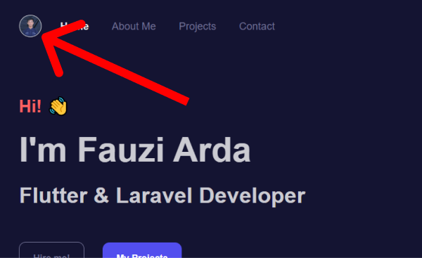
Finally, the top left icon is a link that goes nowhere. I was expecting it to go to the home page, as would all the site's visitors.
![]()
Usability score: 7/10
Design
The good
If there's one thing that is done well here is the website's design. Straightforward, and it does the job.
The home page hero section has a cute illustration. I really want to believe this is Fauzi's creation. If it is, well done! If it's not, well done for fitting it so well with the rest of the site!

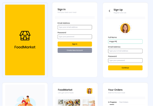
In the project pages, the project are center stage. Not too much text, just large thumbnails that captivate the viewer to get a better idea of what the project/app is all about!
Suggestions for improvement
The colour could use some adjustments to make them more accessible. See Accessibility section.
Design score: 8/10
Responsiveness
The good
Fauzi's website is a site that works well on phone screens and is quite responsive.
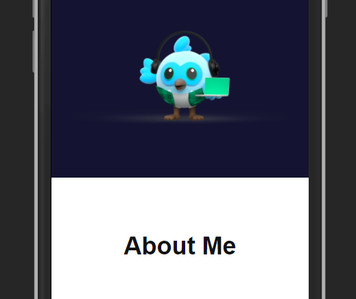
The navigation is neatly tucked in into a hamburger menu which is quite nicely designed!

Suggestions for improvement
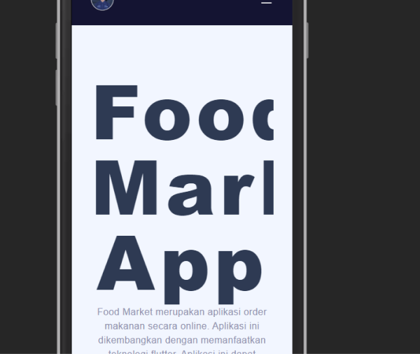
What needs attention is the font size of the headers in the project pages. It looks massive on small screens which is not quite a good look!
Responsiveness score: 7/10
Accessibility
The good
Fauzi has used semantic HTML tags like <section>, <header> and <footer> on his website. Great for accessibility!
Suggestions for improvement
I would like to see further usage of semantic HTML like <main>
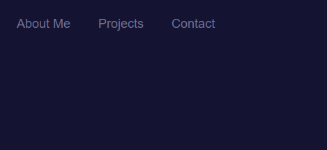
There are contrast issues with the colour scheme Fauzi has chosen:
The top navigation…
The Hire Me link…

And copyright notice…

All use the same text-background colour combo which fails contrast tests:
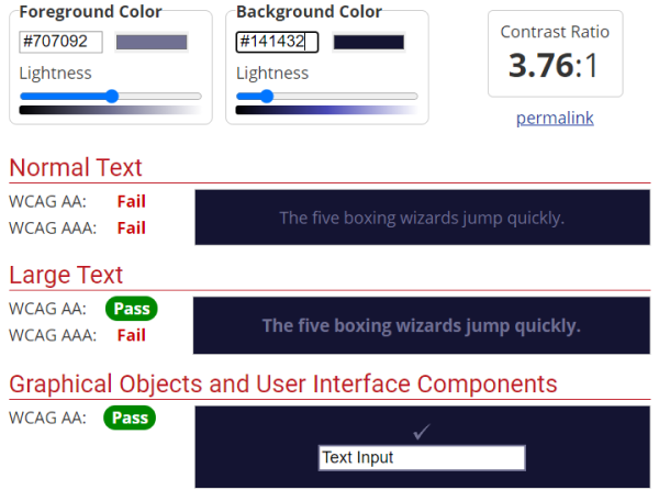
The small text under the Projects section on the home page also fails contrast tests:
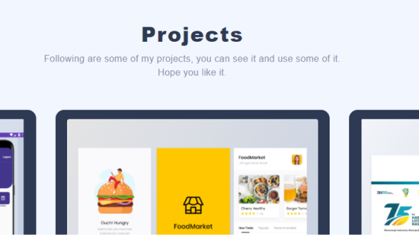
This is what WebAIM says about this:

Finally there's an issue with the top left icon in the header. As well as the issue we discussed before, where the link doesn't lead anywhere, the image also doesn't have alt text. This means that the link doesn't have any text for screen readers to read, so a screen reader user will have no idea what the link is about.
Accessibility score: 6/10
Conclusion
Fauzi Arda has created a website with a beautiful design and project pages that gives the projects themselves take center stage. This design however comes at a cost to accessibility.
Final score: 7/10
Reviews (14 part series)
- Website review #1 - Cadejo.Dev (Vinicio Vladimir Sánchez Trejo)
- Website review #2 - Concrete and Lavender (Maria Spyrou)
- Website review #3 - Twitter Butler Digest
- Website review #4 - Coding with Ease (Godspower Eze)
- Website review #5 - Catalin Pit
- Website review #6 - Agathe Badia
- Website review #7 - DenisWritesCode (Denis Mutinda)
- Website review #8 - Timothy Adeyeye
- Website review #9 - Fauzi Arda
- Website review #10 - Tech Stack Banner (Andy Griffiths)
- Website review #11 - Baljeet Singh
- Website review #12 - Gabriel Lazcano
- Website Review #13 - SoftWar by RepublicOf1 (Benjamin Green)
- Website review #14 - Randy Davoh
