Website review #7 - DenisWritesCode (Denis Mutinda)
Introduction
After I posted a tweet on the 19th of March asking for followers' websites, Denis submitted his own with a simple message:
Ready for you to tear it apart
This shows the confidence Denis has on his website and is not afraid of constructive feedback and criticism. This alone is an important attribute for any developer, new or old.
So here's the review.
The Good
Eye-catching Tag Line

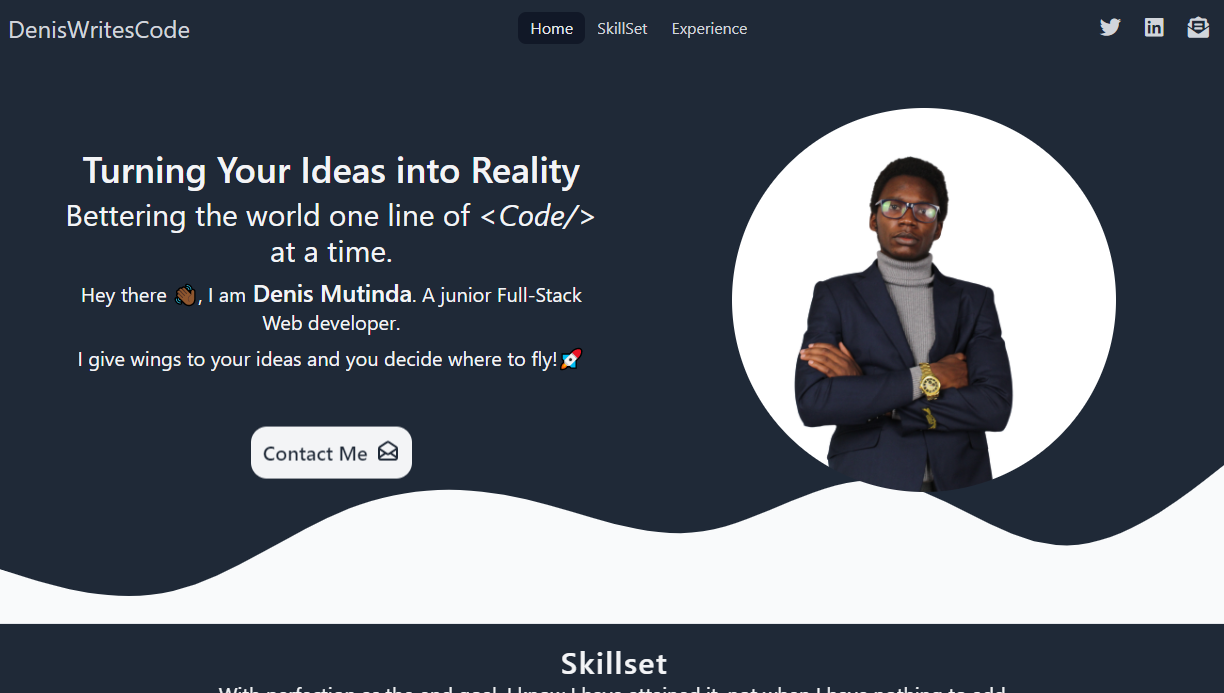
The first thing my eye caught once I entered the website was the tagline:
Turning Your Ideas into Reality
Bettering the world one line of code at a time.
A visitor can read these lines and think "wow Denis really cares about his visitors and his clients. I sure want to work with him. Simple but effective!
Back to top

Denis has conveniently put a "Back to top" link at the bottom of his website, so visitors can easily go back to where they started. A very considerate step. I would've liked it to be more static (permanently stay at the bottom right of the screen while I scroll), but it's a good step nonetheless.
Keyboard accessible
When I tested how the website works with only a keyboard, I was happy to find that every section and link is accessible with a keyboard.
Testimonials
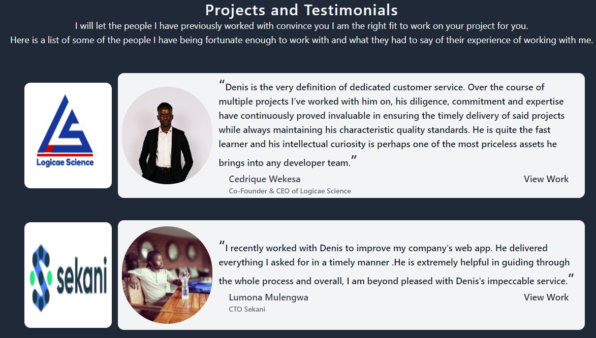
A very interesting section in Denis' website is the Testimonials section. Nothing says "I can trust Denis to do a good job" than a showcase of what other people have said of his work and dedication. Excellent work!
100% SEO
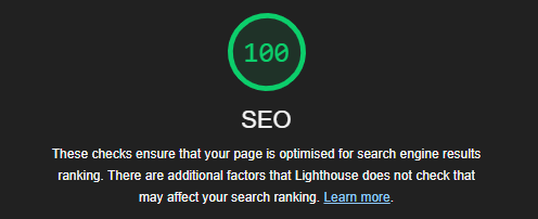
When running a Lighthouse check on Denis' website, it gave a score of 100% on SEO. Nice!
Improvements
Accessibility improvements
Contact Me button
The Contact Me section under the tagline contains two focusable elements: a <a> link and a <button>. This means that when accessed with a keyboard or screen reader, this section gets the focus twice. This is an unnecessary inconvenience which could be avoided quite easily.

Social media icons
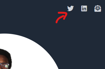
The social media icons at the top right of the website are a good addition, however they can't be read by a screen reader because they don't have any text on them. I've talked about this in a previous article on how to make social media icons more accessible.
Insufficient contrast
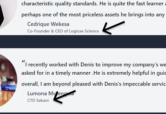
In some cases, the contrast between the background and text colour is insufficient.
Such is the case with some of the text in the Testimonials section.
WebAIM contrast checker shows a failure for small text for the colours of the text and background.

Github link problems
The Github link in the Skillset section is only clickable in a small area at the top of the link. At first, I thought the link was not clickable at all, but on further testing a small area at the top is actually clickable. This can be quite confusing and not sure what causes it.

Pointer cursor on non-clickable image
On the website header, there's an image with a portrait of Denis. When you hover over the image, a pointer cursor appears, giving the impression that it's a clickable link. That is not the case. It's just a CSS property giving the image the pointer. That can be very confusing for the visitor.

Needs Javascript
Finally, I tested the site with Javascript disabled. What appeared was a blank page with the text,
You need to enable JavaScript to run this app.

While it's usually not that big a deal, this is an opportunity for improvement. Browsing the site, I don't see anything that absolutely needs Javascript to run. I believe the site could just as well run without it.
Conclusion
Denis has made a website that visitors see and say "I've come to the right person for the job". Some confusing parts and a few opportunities for improvement.
Score: 7/10
Reviews (14 part series)
- Website review #1 - Cadejo.Dev (Vinicio Vladimir Sánchez Trejo)
- Website review #2 - Concrete and Lavender (Maria Spyrou)
- Website review #3 - Twitter Butler Digest
- Website review #4 - Coding with Ease (Godspower Eze)
- Website review #5 - Catalin Pit
- Website review #6 - Agathe Badia
- Website review #7 - DenisWritesCode (Denis Mutinda)
- Website review #8 - Timothy Adeyeye
- Website review #9 - Fauzi Arda
- Website review #10 - Tech Stack Banner (Andy Griffiths)
- Website review #11 - Baljeet Singh
- Website review #12 - Gabriel Lazcano
- Website Review #13 - SoftWar by RepublicOf1 (Benjamin Green)
- Website review #14 - Randy Davoh
